The right way to serve responsive images (srcset and sizes attribute) with WordPress and Bootstrap 5
Steven 30.12.2020
The most confusing thing when you inspect responsive images is the fact that the browser takes into account the DPR (Device Pixel Ratio) in order to download the most appropriate image size.
Steven
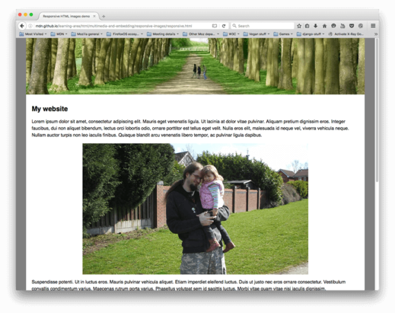
An excellent article detailing the use of the srcset and sizes attributes is available here

Responsive images – Learn web development | MDN
https://developer.mozilla.org/en-US/docs/Learn/HTML/Multimedia_and_embedding/Responsive_images
What is the Device Pixel Ratio (DPR)?
Find out the Device To Pixel (DPR) of your device by opening up the page inspector (e.g. Chrome Devtools), typing in the console
window.devicePixelRatioWhat exactly is device pixel ratio?
The device pixel ratio is the ratio between physical pixels and logical pixels. For instance, the iPhone 4 and iPhone 4S report a device pixel ratio of 2, because the physical linear resolution is double the logical linear resolution.
Physical resolution: 960 x 640
Logical resolution: 480 x 320
https://stackoverflow.com/questions/8785643/what-exactly-is-device-pixel-ratio#:~:text=The%20device%20pixel%20ratio%20is,double%20the%20logical%20linear%20resolution.&text=Other%20devices%20report%20different%20device,%2C%20including%20non%2Dinteger%20ones.
Make a breakpoint table for responsive image widths
Below example for standard Bootstrap 5 grid layout and two image sizes ‘full‘ and ‘medium‘. The medium image is displayed in a col-md-4 column
| breakpoint | max-width image full | max-width image medium |
|---|---|---|
| xs (<576px) | 576px | 576px |
| sm (≥576px) | 540px | 540px |
| md (≥768px) | 720px | 240px |
| lg (≥992px) | 960px | 320px |
| xl (≥1200px) | 1140px | 380px |
| xxl (≥1400px) | 1320px | 440px |
You can fine-tune the above table by also taking into account $grid-gutter-width and any other customizations to the grid layout on your end.
Choose sensible breakpoints for responsive images
Media settings are available in Settings > Media. A good choice for WordPress default image sizes would be
| image format | image size [px] |
|---|---|
| thumbnail | 380px |
| medium | 576px |
| medium_large | 960px |
| large | 1320px |
Serve responsive images
You can take control over what image size information is given to the browser.
The sizes attribute tells the browser how much screen width the image will take
Take into account the image size and the responsive breakpoints when you fill in the sizes attribute. The below goes in your functions.php file.
function assistancy_responsive_images( $attr, $attachment, $size ) {
  if ( $size == 'full' ) {
    $attr['sizes'] = '100vw';
  }
  else {
 // make any customizations based on other image sizes here
    $attr['sizes'] = '(min-width: 768px) 440px, 100vw';
 // expand to include as many breakpoints as you like. List the larger ones first!
  }
  return $attr;
}
add_filter( 'wp_get_attachment_image_attributes', 'assistancy_responsive_images', 10, 3 );
Verify responsive image styles are working in WordPress
Take into account the Device To Pixel ratio of your device when verifying if responsive images are working! Example verification:
- image formatted medium
- testing screen width is 1440px
- Available width for the image is 428px
- Device To Pixel (DPR) ratio is 2.0
- Sizes attribute tells me I have 440px available. Note: we can improve by substracting gutter width here 🙂
- Browser will correct this taking into account DPR → 440 x 2 = 880px → browser will look for an image at least 880px wide
- Browser can choose from 380 / 576 / 960 / 1320 → it should pick the 960px version
Regenerate image thumbnails in WordPress
Each time you make changes to responsive image formats, a regeneration of thumbnails is needed for all existing media on your website.
The most easy and straightforward way is to get console access to your hosting server. Navigate to the website root (e.g. www/ or public_html/ and let WordPress do the work
# Regenerate all thumbnails, without confirmation.
$ wp media regenerate --yes
Remove image styles in functions.php
In case you have additional image style definitions in your theme or plugin, you can clean them up like this:
// remove any custom image styles
function remove_extra_image_sizes() {
  foreach ( get_intermediate_image_sizes() as $size ) {
    if ( !in_array( $size, array( 'thumbnail', 'medium', 'medium_large', 'large' ) ) ) {
      remove_image_size( $size );
    }
  }
}
add_action('init', 'remove_extra_image_sizes');
Further reading

Responsive Images: Improving performance by letting the browser do the work
We want to serve appropriate images to all of our users, like small images on slower connections and small screens, and large, high-quality images on fast connections and high-resolution screens. Luckily, all modern browsers support a few nifty HTML features to help us optimize our images for whate…
https://formidable.com/blog/2019/responsive-images/
Comment
Related
Enforce strong passwords in WordPress, optimize password strength estimator
A very easy way to enforce strong passwords in Wordpress, is to disable the 'confirm weak password' checkbox. On top of this, we optimize the loading of the password strength estimator, zxcvbn.
WordPress 403 Forbidden after using WordPress app
Wordpress 403 Forbidden errors typically happen with corrupt .htaccess or faulty file/folder permissions. A third common cause is often overlooked: the use of the Wordpress app through XML-RPC.
How to host font files locally and preload them
Custom fonts are a great way to improve your online visual appearance. In order to make sure that custom fonts don't slow down your website, make sure you (i) host the font files locally and (ii) preload them. This article describes the process of obtaining and serving font files from your own server, as well as preloading the right font file for faster website loading.


Joe barrett
06.10.2023 - 19:41Great help here. I defeated the DPR by using 50vw and now I get the 5kb small on mobile! Thanks for the starter code.
murat
12.11.2021 - 18:29Steven thanks for reply. Ok. I am using this plugin on my site https://wordpress.org/plugins/ewww-image-optimizer/. This plugin also creates webp images. In html, the following code appears.
Manzara In this case, will webp images be included? Thank you for your help.
murat
11.11.2021 - 19:48First of all, thank you for the article. There are only 3 options in the wordpress settings>media section. There are only Thumbnail, medium, large options. There is no medium_large option, which is the 4th option mentioned in your article. ???
Also in this line;
// make any customizations based on other image sizes here
$attr[‘sizes’] = ‘(min-width: 768px) 440px, 100vw’;
please give everything. We are not experts. Please add them all. thanks.
Steven
11.11.2021 - 20:30Hey Murat,
The media section lists only three options, nevertheless WordPress has by default 4 images sizes (medium_large is not listed).
Here is an example srcset configuration that distinguishes between ‘full’ images and everything else:
/* Serve responsive images with the srcset and sizes attributes.* This function checks the image format requested.
* 'Full' images are served according to Bootstraps maximum container widths at different breakpoints
* Other images are served according to maximum card width at different breakpoints
*/
function assistancy_responsive_images( $attr, $attachment, $size ) {
if ( $size == 'full' ) {
$attr['sizes'] = '(min-width: 1200px) 1140px, (min-width: 992px) 960px, (min-width: 768px) 720px, (min-width: 576px) 540px, 100vw';
}
else {
$attr['sizes'] = '(min-width: 1200px) 380px, (min-width: 992px) 320px, (min-width: 768px) 360px, (min-width: 576px) 270px, 150px';
}
return $attr;
}
add_filter( 'wp_get_attachment_image_attributes', 'assistancy_responsive_images', 10, 3 );